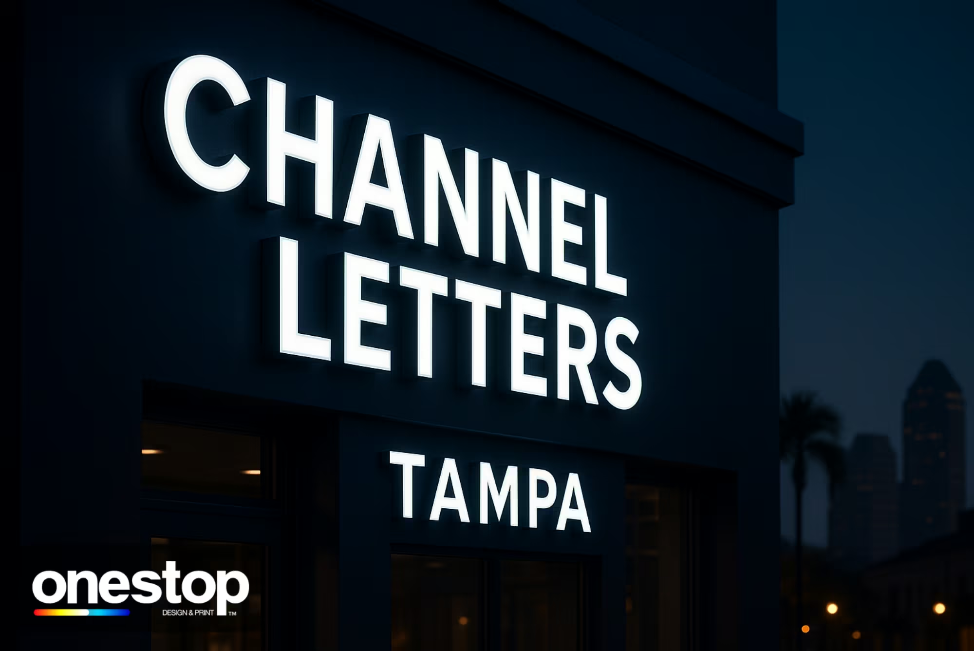
How to Make Your Channel Letter Signs Stand Out in Tampa
Channel letter signs are one of the most effective ways to get noticed on busy Florida streets. Built with aluminum, acrylic, and energy-efficient LEDs, they deliver depth, durability, and strong nighttime visibility. In a competitive Tampa market, your storefront sign works like a 24/7 salesperson—so the details matter. This guide explains how to choose the right style, materials, lighting, and local planning steps to keep your channel letters clear, compliant, and visible day and night.
How to Pick the Right Channel Letter Sings Type
The best channel letter style depends on viewing distance, brand personality, and the lighting around your building. In Tampa, where drivers move fast and plazas stay busy after dark, readability is a top priority.
Front-Lit Letters — These create bright, uniform LED illumination through the face, so they’re a smart choice for wide roads, busy plazas, and long-distance visibility.
Back-Lit (Halo) Letters — This style produces a soft glow behind each letter, which creates a premium, architectural look for offices, clinics, and restaurants.
Combination-Lit Letters — With front-lit clarity plus a halo glow, this option delivers strong visibility from the road and an upscale look up close.
Open-Face Letters — Exposed LED or neon-style tubing creates a bold, retro vibe. This works best for nightlife, entertainment, and brands that want a statement look.
Non-Illuminated Letters — A cost-effective option for interiors or well-lit façades. Use clean fonts and bold strokes to stay readable at dusk.
How to Choose Materials That Last in Florida Weather
Florida weather can shorten sign life if the build isn’t made for heat, humidity, and storm seasons. Strong channel letters start with corrosion-resistant metals, UV-stable faces, and properly sealed components.
Aluminum Returns & Backs — Lightweight, corrosion-resistant, and reliable in coastal humidity across Tampa Bay.
UV-Stable Acrylic Faces — Helps protect color accuracy and reduces yellowing under intense Florida sun exposure.
Sealants & Hardware — Marine-grade fasteners and weatherproof gaskets help reduce moisture intrusion during summer storms.
Powder Coating — Adds a tough protective finish against salt air, heat, and abrasion while improving color depth.
How to Get Lighting Right
Most channel letter signs look “premium” or “cheap” based on lighting setup. Good LED quality and correct spacing create smooth illumination that stays even across the entire face.
LED Modules — High-efficiency LEDs deliver bright output with lower power draw and long service life.
Brightness & Spacing — Correct module pitch prevents hotspots and dim zones for a cleaner nighttime look.
Color Temperature —
-
Neutral white (4000–5000K) reads crisp for retail and modern storefronts
-
Warm white fits hospitality, dining, and upscale brands
Special Effects — RGB and dimming can help for events and promotions, but clean white lighting is often the most readable choice.
How to Mount Channel Letter Signs for Clean Lines and Easy Service
Mounting impacts both the final look and long-term service access. It can also affect approvals in managed plazas, where signage guidelines are common.
Flush (Direct) Mount — Letters mount individually for the cleanest look. Plan concealed wiring and penetrations during design.
Raceway Mount — Letters attach to an aluminum raceway for faster installs, easier service, and fewer wall penetrations.
Backer Panels — Adds contrast on textured or dark walls, hides wiring, and improves readability from the street.
How to Size and Space Letters for Drive-By Readability
A sign can be well made and still underperform if the letters are too small. Smart sizing and spacing improve clarity when people see your storefront from moving traffic.
Letter Height vs. Viewing Distance — Match size to setback and roadway speed so drivers can read quickly and react.
Stroke Weight & Fonts — Avoid ultra-thin strokes. Choose clean fonts that hold their shape when illuminated.
Kerning & Word Spacing — Balanced spacing improves readability from angles and multi-lane approaches.
How to Match Brand Colors Without Sacrificing Legibility
Brand colors matter, but contrast is what makes a sign visible. When colors blend into the building, simple design adjustments improve readability without changing your brand.
Pantone & Vinyl Matching — Use face films and paints that align with brand guides while maintaining proper diffusion.
Contrast on the Façade — Add a backer panel or halo separation when the wall color reduces visibility.
Logo Shapes & Icons — Fabricate logos as channel “shapes” so complex marks stay crisp at real-world sizes.
How to Plan for Tampa Permits and Code Compliance
Permitting can affect your sign size, placement, brightness, and timeline. In Tampa Bay, rules can change by district, and managed plazas often add their own sign standards.
Start by reviewing allowable sign sizes, projection limits, height above sidewalks, and lighting requirements. Then prepare a complete permit package with drawings, mounting details, load paths, and electrical specs.
If your storefront is in a shopping plaza, check the tenant handbook early. Many properties require raceways, limit colors, or enforce alignment rules to keep signage consistent across the center.
How to Install Safely and On Schedule
Installation quality is what makes channel letters look premium up close. It also affects how long the sign holds up in Florida weather.
Begin with a site survey to confirm the mounting surface, structure, and power access. Next, plan lift access, barricades, and safe electrical shutoffs.
During installation, letters must be leveled and aligned precisely so the layout looks clean from the street. After that, seal all penetrations and returns to help prevent water intrusion and keep lighting even over time.
How to Maintain, Retrofit, and Repair
Even premium signs benefit from routine care. Florida humidity, salt air, and pollen can build up over time, so simple maintenance helps keep your sign looking sharp.
Older neon or dim LEDs can be upgraded to modern modules for brighter output and lower energy costs. Use properly rated power supplies with ventilation to extend performance. After major storms, inspect fasteners, seams, and gaskets, and keep faces clean to preserve brightness and color.
How to Budget Without Cutting Critical Quality
If you need to value-engineer, focus on what customers notice first. Visibility and readability drive results more than extra features.
Prioritize letter height, stroke weight, contrast, and brightness. Reduce cost with raceways, standardized LED modules, and efficient wiring that lowers labor without hurting clarity. If needed, phase upgrades—start with front-lit letters now and add halo or RGB later.
How to Choose the Best Locations in Tampa Bay
Location decides how big, bright, and bold your sign should be. Traffic speed, viewing distance, and area guidelines change the best design approach.
High-traffic corridors like Dale Mabry Highway, the Westshore District, and Gandy often benefit from larger letter heights and strong contrast for drive-by visibility. Areas with stricter aesthetic expectations—such as Ybor City—may require a more refined style or reduced brightness.
In suburban plazas in Brandon, Riverview, Lutz, Wesley Chapel, and Temple Terrace, follow the tenant handbook so signage stays compliant and visually consistent with neighboring storefronts.
How to Order Channel Letter Signs in Tampa
Start by sharing your logo, brand colors, and a clear photo of your building façade. You should receive a design proof with recommended letter height, lighting style, and mounting method based on your location and viewing distance.
Once approved, fabrication should include sealed returns, clean internal wiring, and tested LED components. Professional installation and long-term support help keep performance strong over time.
Top Indoor & Outdoor Signs
Best-selling stretch, round, 4ft, 6ft, and 8ft custom table covers — all printed in vivid color with fast Tampa pickup or Florida delivery.
Customer Reviews
Owner's reply
Thank you so much for your amazing feedback! We're thrilled to hear that you loved the service, quality, and signs. It's wonderful to know that everything exceeded your expectations. We look forward to working with you again in the future!Posted on Google
Owner's reply
Thank you so much for your fantastic review! We're thrilled to hear that you are pleased with our quality, delivery speed, and pricing. We look forward to serving you again soon.Posted on Google
Owner's reply
Thank you so much for the love and support! We're thrilled to know you had a great experience with us. We look forward to serving you again in the future!Posted on Google
Owner's reply
Thank you so much for your positive feedback! We're delighted to hear that you're satisfied with the banner's quality and price. It's our goal to provide excellent service, and we're thrilled to have met your expectations. We look forward to serving you again!Posted on Google
Owner's reply
Thank you for your kind words and recommendation! We are thrilled to hear that you are satisfied with our services and quality. We look forward to serving you again in the future.Posted on Google
Owner's reply
Thank you for your kind words and continued support! We're thrilled to hear that our quality and service continue to meet your expectations, even from afar. Shipping directly to you is just one of the ways we strive to make sure your experience with us is hassle-free and convenient. Your recommendation means a lot to us, and we look forward to assisting you with future printing needs. Thanks again!
Join Our Newsletter
Join Our List for the Best Custom Printing Deals in Tampa — Only at OneStop!